Thursday 31 December 2009

Owen Goldersleeve


I love this - found it on Nate Williams blog - postcard by Owen Goldersleeve of Collective Evening Tweed.

Wednesday 30 December 2009

Ethical wood?


Last year the World Wildlife Fund (WWF) published a report claiming that up up 30% of the wood we use comes from illegal sources, with the UK the second-biggest imported in Europe. So how can you be sure that when you buy bark, fencing panels and garden furniture, you're not contributing to deforestation, climate change & environmental damage...

With a look of "hello, where is everyone", the baby slid into my arms...

The unexpected delivery of a baby at home by the father.

Seasons Greetings!

Lots of snow!

Crab apple or nettle wine - which is it to be?

Monday 30 November 2009

Our England is a garden full of stately views...and avenues...peacocks strutting by...

This image is inspired by Alan Titchmarsh's comment page at the back of BBC Gardener's World magazine! He has used quotes from Kipling to expand on his love of avenues of beech trees. I loved the idea of morphing peacocks and beech trees.

AOI Images34 book

I was thrilled to find my fox image has been accepted for publication in the AOI Images 34 book next year. Here is the image.

Mousey and the Red-Eyed Monster


I have been reworking my Mousey And the Scary Climate Monster story in the light of comments from others at SCBWI (Society of Children's Book Writers And Illustrators) - which has been very helpful. Here is the revised storyboard. The monster is less literal and more is left to the imagination with him. Also, there is more about Mousey at the beginning.

The Enormous Crocodile


Another double-page spread completed! Also more tweakings to mugglewump and background.

I have re-vamped my website, too, using iweb. This is very user-friendly, although the options are fewer than those in Dreamweaver, and the download time is longer than my previous website (although this may also be because I've put in larger images this time!).

The Fox the Crow & the Smelly Old Cheese


I have been working on a storyboard based on one of Aesop's Fables and have completed a colour double-page spread.

Tuesday 20 October 2009

The Enormous Crocodile


Here's the latest revision. Croc is less scarey, Mugglewump is swinging from a branch and the log has been merged into the background a bit more. I'm going to leave this for a week or so and come back with fresher eyes...I'm not sure now whether to tone down Mugglewump's colour...

Tuesday 6 October 2009

Plum Pudding childrens book agent

I joined Plum Pudding in August and am now up on their website at http://www.plumpuddingillustration.com/.


I am currently making some other images to go on their website, using text from Roahl Dahl's The Enormous Crocodile. Here are a couple of them. I am pleased with the movement in them & also the colour pallette. I prefer the one with the textured background and my children prefer it too, because it has more depth and interest.   However, there is a voice in my head that keeps saying, 'less is more', but I think too little can be sterile, in a children's book. I need to work on the monkey, Mugglewump, and make the croc a little less scary. I have been looking at the textures in Eric Carle's  and Catherine Rayner's (Augustus and His Smile) work, and combining ink and tissue.

Thursday 10 September 2009

Zaha Hadid

Amazing architectural acoustic installation at City art gallery where audience wrapped in what seemed like a very large ribbon.

MMU show June 09

I was impressed by a lot of the illustrations in the MMU show - especially Gemma Wood's textured inkwork.

Thursday 25 June 2009

The Magic Puddle


Here is an image I made last year for my story idea, The Magic Puddle. The collage and ink is very similar to the fairy image in the last post, although it is combined with tissue paper rubbings rather than plant material.

Freddie and the Fairy


I entered the Waterstones competition last month in a hurry, since it was due in a week after the major hand-in. I used a lot of found plant material which I combined with images I had already made. It was fun to do and here are some of the results. I need to rework some of them so they gell together a bit more. I am pleased with the fairy and the mouse.

Mousey and the Scary Climate Change Monster


Here are the updated images for Mousey and the Scary Climate Change Monster. The animals seem to work a lot better when they go across the double page spread. Now I need to work on the monster a bit more to make it more scary and more original.

Here is the storyboard too, in b&w.


Tuesday 23 June 2009

My Website

My website is up and running on www.annaviolet.co.uk

Thursday 30 April 2009

Mousey and the Scary Climate Change Monster


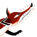
These are some of my images for my major project, using inks and collage.

Thursday 23 April 2009

Big Orange Studio collective


Talk from Andy Pavitt 22/04/-9

Andrew Pavitt came to talk to us about the Big Orange Studio collective in Shoreditch, London. Big Orange can offer an internship for a Stockport College student this summer for one week, which would be a good opportunity to make contacts and get a feel for what a collective is like. Last year, Dan & Martin from Stockport were involved with an AOI poster which got mailed out with the magazine - & they were able to take 500 copies of the poster away with them.

The studio collective was started 15-16 years ago by RCA students including Andy Lovell and Darrell Rees. Peepshow, Container and Le Gun are all collectives, too. Big Orange currently has 8 illustrators and shares studio space with AOI, which has anywhere between 4-12 people, depending on any internships (AOI also take on illustration graduates – recently from RCA, Kingston, London).

Andy talked about the many advantages of a collective – pooling resources, sharing rent (£200/month each), phones, photocopier, computer network. Maybe the biggest advantage is the support network to keep you going at illustration. If you work on your own you need to be very well organised, good at promotion and not prone to loneliness. He feels they have a good mix of skills and personalities at the studio. They even share contacts, although this can be a problem at times if someone has spent a lot of time building up a contact. The Editorial contacts are maybe less precious, though. They do occasionally work together, although they have not done so recently. Paul Davis is the illustration editor for The Drawbridge paper, a good promo magazine & platform for illustration (comes out once/2 months).

The studio is open 24 hours/day, and this is really important in order to meet deadlines, especially for editorials with daily papers and work in America, where there are different time zones. Toby Morison sometimes comes in at 5am to meet a deadline, and then takes a kip in the studio!

The disadvantage to a collective? You need to fit with others and their music tastes. The dynamics change with the mix of people, and personality clashes could be a problem, although it has not really been an issue at Big Orange.

I had thought I would prefer to work as an illustrator from the comfort of home, but I can now see the numerous advantages in working as part of a collective and pooling resources and support. It would be a lot more expensive, though, and the pressure to find work would be more intense in order to pay the studio rent.

Saturday 18 April 2009

Comparison between 2 practitioners


I have chosen to compare and contrast Chris Corr and Otto Dettmer as practitioners. I visited Chris in London and listened to Otto's talk last month. They are very different in their processes and practices; they operate in different markets, with few overlaps. What can I learn from this that I can apply to my work?


Chris Corr is an fine artist as well as an illustrator. He trained at the Royal College of Art and won a drawing prize to study in America. This perhaps enabled him to get started on his path as an illustrator in the travel market. He has managed to translate his talent for observational drawing and painting into successful contemporary illustrations. He also taught drawing one day/week when he was establishing himself. His colouful gouache illustrations have a clear and unmistakeable style. They are warm and tactile with a folk art feel. He only uses the computer to scan his work in.


Apart from travel illustrations, Chris’s market includes editorials, children’s books, adult fiction and world map canvases. His clients are wide-ranging and include Qantas, Windstar Cruises, Royal Mail, Folio Society, Sherbet, BBC, Barefoot Books and Habitat. His agent, Illustration Web, gets him 1/3rd of commissions. For promotion, he sends emails, contacts ADs and has exhibitions of original works. After a trip to India, he came back with a one-person show, ‘Wel-come to India’, which was followed by a book and a short BBCTV film. Royal Mail sent him to Bosnia to paint the peace-keeping troops. Although Chris works on his own, he does team up sometimes with Brian Grimwood to do work for resturants and magazines.


Chris’s influences include folk art, primitive art, the Contructivists, Le Corbusier, Paul Klee, Ben Nicholson and Max Beckham. His passions appear to include travel, observation and painting.


Otto Dettmer, on the other hand, is a conceptual illustrator who largely specialises in editorials. He started off on a graphics course in Bristol, and followed this with an MA in screen-printing at Kingston. His commercial work is a mixture of photography, found images and flat shapes worked up together on the computer. He also makes screen-printed books for bookfairs. He is also fascinated by consumerism and consumer culture. His editorial work is conceptual, clever and pared-down with a simple message, but it is not always instantly-recognisable as Otto’s work.


Otto’s illustration market is mainly confined to editorial work, although he has done 2 big advertising jobs, which he didn’t enjoy. His editorial clients include the Guardian, Independent, Telegraph, Times Supplement, Economist and Time Out. His market does extend into Europe, with work for Le Monde and Freitag. He was unable to get an agent, which he thinks is because the editorial market is not very lucrative and his style is not always clear. He is very much a lone wolf who certainly doesn’t want to work with other illustrators. He is very persistent in his marketing approach, and used to travel to London once/week with 7 appointments/day, seeing ADs and agents. He doesn’t think his early work was very good and he often didn’t get further commissions from the client, but his persistence and practice has paid off. He regularly sends out promotional materials, often original and screen-printed. He finds that getting his work into daily national papers is also very good self-promotion. He also resells his work wherever possible, and advertises this on his website.


Otto’s influences include Polish poster designers, film (especially Hitchcock & Lang), Russian constructivists, Renaissance painters, neo-classical painters and sculptures, photography and found imagery. His passions appear to include screen-printing books and bookfairs.


Otto has had to embrace computer technology and compile an extensive library of images (over 1000) to enable him to meet tight editorial deadlines, where he may only have a few hours to prepare and send off the image. Chris has built up a lot of observational studies during his travels, which he is able to translate into his illustrations. Chris has a more traditional, fine-art approach than Otto, but also has more time to develop his illustrations as paintings, which he can supplement with exhibitions of original paintings. Otto, on the other hand, is in a less lucrative market and has to resell his editorial images.


What lessons can I learn from the way these 2 practitioners work? To make it in illustration you have to make striking images that communicate well, like both Chris and Otto do. I would need to work on this! I can do the observational studies, but have difficulty translating these into successful contemporary illustrations. You also have to be persistent, determined, professional, efficient, good at networking and lucky. I need to develop my networking and efficiency. I would personally prefer Chris’s broader market to Otto’s, because I think it is more interesting and varied. You can also spend more time away from the computer and not be faced with constant tight deadlines. I also prefer making and drawing to spending lots of time on the computer, but I find the computer is very useful for tweaking and adapting images. However, I think editorial work is a good way to get started, because there is so much of it (unfortunately, along with thousands of illustrators chasing it!). Also, I was hoping to do some b&w children’s illustrations for the educational market, which is apparently abundant (AOI Children’s seminar 2007), if you can draw children okay. I will also approach gardening and baby/children’s magazines. I do also occasionally exhibit my paintings and take commissions to sketch children’s portraits, and I could expand this some more with a more contemporary edge. I like the idea of having an agent who can not only bring you work, but also get your work in front of particular clients, such as Scholastic Educational Publishing. However, I need to have had some work published first and done a fair bit of promotion on my own. I also realise that finding the right agent can be difficult.


My passions include our environment, books and making images. I adore textures and materials and love working in ink, collage, clay and tissue paper. I also enjoy drawing from observation, especially people. I therefore also intend to target editorials with famous faces/climate change issues, and I aim to develop this in the final stages of my major project.

Agents Who Needs Them


Does an illustrator need this middleman in the creative process? What do agents do for their percentage? Can they enhance or hinder your career or creativity? What methods have new illustrators used to promote themselves in the past and what methods do I intend to use?  

An agent isn’t for everyone, and agents can be quite choosey who they take on. Also, they rarely represent new graduates. The main problem is finding the right agent for you and the right mutual agreement. The AOI’s The Illustrator’s Guide to Law and Business Practice (Simon Stern 2008), the AOI's Survive (2001) and Darrel Rees’s How To Be An Illustrator (2008) have loads of advice on this. A lot will depend on how much self-promotion you want to keep on doing and whether you are keen to have direct contact with your clients. Also, illustrators can be keen to get an agent because they think doing so can give them security and employment, when this is not necessarily the case. Darrel Rees points out that having an agent can actually end up feeling like a prison sentence! 

The Society of Artists' Agents (SAA) was formed in 1992, and this works with the AOI with the broad aim of improving the working practices between illustrators, agents and clients. The AOI lists agents who are members of the SAA on their website. The AOI also has a chatroom where many illustrators post up their experiences of agencies.

What do agents do for their percentage of 20-30%? The agent can offer experience and professional advice, use the reputation of the whole agency to promote you, give you access to a particular pool of clients and negotiate the larger more complex jobs on your behalf (Rees 2008). They also take portfolios to clients, keep portfolios updated and fresh, do invoicing and paperwork and act as a buffer between the illustrator and the client (Stern 2008) Joy Monkhouse, the design manager from Scholastic Educational Publishing, said (at AOI Children’s Book seminar 2007) that they always go through agencies to get illustrators, rather than respond to individual illustrators.  

You have to find the right agent who deals with your kind of work. Darrel Rees points out that by using an agent, you may lose the chance to start learning from your own experience and to establish your own client base. Some agents are happy to let the illustrator deal with editorial work, while they concentrate on the higher-paid work (advertising and design group). The AD for Gardeners World told me he tended to deal directly with illustrators rather than agencies (although he did use Inkshed agency), perhaps for this reason. Ian Pollock told me (telephone interview 2007) that his agent (Inkshed) was there for the big job. Jill Calder had a UK agent (Eastwing) for a short while, but then decided she would rather do her own promotion in the UK, but she let another agent, Friends and Johnson, promote her in America and negotiate any big jobs in Europe, such as advertising campaigns. Jill reckons agents can earn you more money for a job, if you have the right one. This is because they are a step removed from your artwork, so they can be very good a telling you where and when you need to market your work, but not all agents are this good (email interview 2009). Andy Martin finds that his agent (Heart) gets him plenty of work and is good at negotiating high fees on his behalf, and this make his hefty monthly promotion payment to the agency worthwhile. Andy has an agent because he got fed up going out and getting work. Andrew Pavitt has had a couple of agents, but they did not work out for him. Illustration Web gets Chris Corr about one third of his work. In other agreements, the agent finds all the work, but this can be a problem if this isn’t enough or the right type. Therefore, it is very important that both the illustrator and the agent are clear on what they expect from each other from the outset.  

Stern (2008) suggests that this agreement should include the following: 
*Area and market.  
*Ratio of agency staff : illustrators (much more than 1:8 could mean not enough work is coming in)  
*Amount of work. *Commission (currently 25-30% basic commissions, 20% editorials, 40% for work outside UK). 
*Promotional expenses (who pays for what).  
*Terms and conditions (copyright & artwork ownership) 
*Invoicing procedures  
*Accounting (how & when illustrator paid & right to inspect accounts) 
*Agency liability (insurance against loss of artwork) 
*Parting company (when does payment of commission cease?). 
Darrel Rees also suggests that you should find out how the agency gets commissions, what clients they have and how they deal with client contracts and disputes. Also, it may help to find out what driving force led to the agency becoming set up.  

Otto Dettmer told us, in his talk at Stockport, that he had tried but failed to get an agent, because agents weren’t interested in getting editorial work and needed a clear style, rather than a conceptual one.  

How do graduates promote themselves? Otto Dettmer used to go to London once/week with 7 appointments for the day, seeing ADs and agents. His editorials in the daily papers now act as good promotion, which he supplements with mail-outs of screen-printed promo work to ADs. Gillian Blease followed AOI advice and did mock-ups for papers which she mailed out and it has taken her 10-15 years to get to this point, and she still does regular mail-outs. Chris Corr won a drawing prize which started him on his travels and ultimately into the travel market. Jill Calder took her portfolio to lots of ADs, listened to their advice, lightened up her style and did lots of networking. She had a style that was flexible without being Jack-of-all-trades. Jill reckons it took her a year to get known in Scotland and a few more years to get known in the UK, when she got work with The Guardian & The Telegraph & also got taken on by an agent. She believes you really have to really be in love with illustration, so no other job will tempt you away, and be prepared to do some jobs as freebies and to do some really crappy jobs too. She suggests you should take advantage of free folio websites and networking events and make as many contacts as possible...be patient, be proactive, organise exhibitions, stalls at festivals, invite loads of designers, and spend money to make money. Jill uses her blog, The ispot, Flickr, 741 Illustration Collective and her website for marketing, and she has links with other websites and blogs, too. She emails out too, and sometimes sends postcards, but she believes nothing beats a visit with a folio and word of mouth networking.  

What methods will I use? Firstly, I have to sort out that fantastic portfolio (could be a problem) and get my website working. Then I need to continue contacting ADs by phone, mail and email. I will target editorial work and publishing, enter competitions, approach environmental charities to do freebies and try and follow Jill’s advice wherever I can on networking. I may need to try and get a children’s book agent (such as Frances Mckay) in order to do b&w linework for children’s educational materials. I had hoped this would be my foot-on-the-ladder work, unless I can get access to this pool of clients directly without an agent.

Saturday 11 April 2009

Climate change

This is an interesting animation on climate change that I came across in my research for my major project. It is animated by staff at Royal College of Art (2008), & Paul Davis is credited too. The graphics are great (largely white pencil lines & textures against & black) and the message is clear (written & directed by Leo Murray).
climate change for dummies in a video Wake up, Freak Out - then Get a Grip
http://wakeupfreako ut.org/film/ tipping.html

This is a link to Robert Newman's A History of Oil, shown on Channel 4 last year, which is laugh-aloud funny, but rather long.
http://video.google.com/videoplay?docid=-5267640865741878159&ei=n8Z7Sb-2C4bCwgO1xr2uDQ&q=robert+newmans+history+of+oil


Robert Stewart


Ian has suggested I look at Robert Stewart for inspiration, and I am very impressed with his work.  He was an influential Scottish designer (1924-1995) who taught at the Glasgow School of Art 1949-84. He was a prolific designer-artist involved with printed textiles, tapestries, ceramics, fashion  & graphics. He produced work for numerous companies, including the Edinburgh Tapestry Company and Liberties (1950s)

His style is based on human forms (skittle-shaped) or faces (moon, sun, masks) and there is hardly a truly straight line in sight. His main motifs are clover leaves, spirals, triangles and circles. He uses the idea of flight a lot, too. His interesting shapes appear to be cut-outs. His style looks quirky and fresh, even today. I like the way line & shape are put together to form a pattern, with a limited selection of colour.

I found a fascinating snippet in Liz Arthur's book, Robert Stewart Design 1946-95 (London 2003, p56), where he describes his selling spree of 1950. "I did my salesman bit, carrying my case around all the best London stores. I learnt a lot ... I was kept waiting for hours, then they wouldn't even look at my wares." In Liberties, the buyer told him to 'take that rubbish away', but Mr Stewart-Liberty himself then asked him to return.

Thursday 9 April 2009

Demetrios Psillos


I have been noticing illustrations by Demetrios Psillos lately in the Saturday Guardian. He's had this clown-like character for a few weeks running, who is very eye-catching. Demetrios is based in London & does work for Vogue, Harpers Bazaar, New Yorker. Spectator, Sunday Times.. He also does lots of portraits. He uses paint & collage & has lots of wobbly lines. Website www.demetriospsillos.com/


Thursday 19 March 2009

Stockporticus Talk from Damian Gascoigne March 09


We had a very entertaining talk from Damian Gascoigne last week. Damian teaches on the animation course at Kingston & has worked as a freelance animation director for the past 25 years. His commercial work fuels his personal projects.

Research
Damian stressed the importance of research for him. He’s always snooping around, doodling, snapping, collecting. He spoke of the joy of sketching on a weeks location in Lisbon with the students last year. He particularly loves observing awkward poses made by the students.

Influences
Japanese illustrator- ‘Ryohei – on ‘cartoon modern’ website. He did 1950s animation in America. Lewis Cook – ‘The Pierce Sisters’ – 3D work hand-rendered & fed back into computer. Also Alexander Calder.

Personal work
Recent projects ‘Compilation’ & ‘The Love Books”. He reckons you need to be obsessive to persue personal work. He kept a picture diary for years with the main theme of unrequited love. This amounted to 27 books! He exhibited part of this collection as ‘The Love Books’, by projecting some of the pages onto an enormous polystyrene book. Also projected animation of a woman rising up out of a table, like a ghost. Quite haunting.

Pitch Requiem
Damien pitched for 7 commercials last year, which he didn’t get. Luckily, his 8th attempt worked. This pitching amounted to 3 months solid work. Don’t get paid to pitch & very expensive & competitive. Toughest year so far for him was last year. Works within Picasso Pictures as a freelance animation director. He loves the work, but said you need nerves of steel in this business.

New Territory

Has started moving into 3D computer animation, but from a drawn animation background. He explains why this is important to him when describing his process for his animation, ‘Careful’ on his website (www.animateonline.org/films/careful/stills.html ), as follows:-

“Firstly I questioned the way in which the 3D line work objects are constructed, by putting together deliberately mismatching surfaces of objects, so that the final piece looked liked badly made flat pack furniture. This betrayed its origins as a series of drawings.
Secondly I left in all the rough by-products of my ink drawings, spatters and blobs, inconsistent line weights, accidental transfers from page to page. The exciting thing for me was that these elements began to exist in the space as well as the main objects, trailing around on their own strange orbits, as chairs and turntables twisted and turned.
Thirdly I decided to disconnect the objects from their ground and background, because somehow every time we connected them together to a camera, the whole thing just ended up looking like an arty computer game. To do this we separated layers of line work and set them on slightly offset paths and then created faked backgrounds that did not follow the same camera path at all, but moved in independent but sympathetic directions.
Fourthly I decided to leave some objects as 2D drawings and others as full 3D objects. Placing them in the same space we allowed the nature of drawing as suggestion of form to remain close to the surface.
The thinking underpinning these decisions came from a belief that the pursuit of ‘reality’ that dominates current thinking in 3D computer animation is a misguided and limited path. We don’t need to worry about how things really look. We can see them perfectly well. It is our job as artists to imagine them again.”

Storyboard is the biggest struggle. He loves working in a team, with animators, modelmakers, technical people – all with specialist skills. Got a modelmaker to build his character & then used combination of 3D animated shapes & drawn elements to flatten the image. He draws small – uses a reed pen & rough materials.

A very thought-provoking lecture, especially on the nature of observation, drawing and re-imagining.

Visit to Chris Corr’s studio in London


Rose & I visited Chris Corr in his studio on 4th March as part of our professional practice trip to London. Chris Corr was very welcoming and answered our questions helpfully and patiently. His studio was packed with shelves full of books, a stack of framed original paintings, colourful observational studies on the wall and a desk with work in progress. Not a computer in sight (he does use one to scan in his final work & send it off). I came away enthused & determined to do more work- even painting - without using the computer.

Influences
Chris had answered an enquiry for Liam a year or so ago about his influences and working methods, so we knew Chris’s influences included modern architecture, folk art, primitive art, the constructivists, Le Corbusier (a painter as well as an architect), Paul Klee, Ben Nicholson and Max Beckham. Chris talked enthusiastically about the current Le Corbusier exhibition at the Barbican and suggested that the British library was well worth a visit too.

Commissions
Colourful gouache paintings, noses often different colours (reflecting different surroundings). Colours influenced by travels - especially to India. Editorials, children’s books (Barefoot Books & others), adult fiction, colourful world map canvases for Habitat. His illustrations for Folio Books were amazing - Simone de Beauvoir’s The Mandarins had sumptuous full page illustrations, and yet it is an adult book. With children’s books, sometimes he teams up with a writer and other times he is teamed up with a writer. Likes to present several ideas for a job. Could see on his desk that his final painted image accurately followed a b&w line rough. His portfolio was full of his commissions.

Promotion
Chris emails stuff & rings ADs. Exhibitions of original painting too. Agent is Illustration Web, who gets him third of commissions.

Lone Wolf
Mainly works on own, but sometimes gets together with Brian Grimwood, who works quickly and uses lots computer imagery. Do work together for restaurants and magazines.

Getting started
Chris won a drawing prize at college which enabled him to live in America for 5 months. He also taught 1 day/week as a drawing tutor. His first commissions were for a newspaper to draw some jazz musicians, some architecture and some poems.

What makes the difference between success or failure as an illustrator?
Drawing, collecting, passion for your work.

What advice would you give to illustrators just starting out?
Be yourself, be organised, meet deadlines, make sure you communicate well.