Friday 28 November 2008

Grant Gilbert (Double G Studios) Guest Speaker 21.11.08

Studied Motion Graphics 20 years ago at Stockport College. Went freelance when he returned from working for ‘Attic’ in New York. 2 years ago he set up name, ‘Double G Studios’ – to give his business more ‘gravitus’. Although he works freelance, he likes to sit in with another company to bounce ideas about. He also finds that working with new people all the time acts like a constant refresher course for him. 

Involved with Channel 5 rebrand, Channel 4 music promo, More 4 identity promo animations (with ‘Spin’ company), BBC 1 rebrand (via Redbee company). Showed us the development of animation for More 4 – a lengthy process - & a strikingly simple and impressive final result (overlapping & repeating simple shapes, transparencies & shadows). He believes “ the simple ideas always work the best”. BBC1 a particularly difficult client because license-payer’s money involved. Took us through the stages of getting the circle theme approved & how they came up with a new rounded fonts, using ‘Fontsmith’ company. Media coverage “1.2M costs” & “Hippo Potty’.

Grant Gilbert believes it is important to work in an office with others, so can bounce ideas off each other. I can see that this is vital for the sort of re-branding graphics work that he does, but I don’t think it is so necessary for an illustrator to work in this way. He can spend 70% of his time pitching for work, compared with 30% through recommendations. He often works by day on one job & pitches for another job later in the evening. He loves the work and has the most fun “when no-one interferes”. He is also a judge & foreman on DA & AD awards & said “the simple always stands out”.

Thursday 27 November 2008

Benoit Jacques


Ian showed me Benoit Jacque's website on www.benoitjacques.com. He's a French illustrator with a lively comic linework style, who also does 3D work.. His flip-books are great. I particularly like his cat cover - full of life and humour.

Monday 24 November 2008

Picture Book 3


Picture Book
Episode 3. Books for Over 10s. (BBC4 Nov 08)

“The wheel & the book – the two greatest inventions of the human mind!” (Philip Pullman)

Final episode with contributions from Eoin Colfer, Ralph Steadman, Alan Lee, David Almond, Jacqueline Wilson, Philip Pullman, David Almond & Dave McKean.

Eoin Colfer talking about how the book can be a visceral and strong emotional part of kid’s lives.

Treasure Island
Written by Robert Louis Stevenson for his 12 year old. Exotic & full of escapist adventure. A story about human nature (Steadman). Need something to identify with & something you know nothing about (Eoin Colfer) – this fits the bill. Fake realism & story to spur imagination (Pullman) – and wonderful to have map in book. Mervyn Peake’s illustrations (1940s?) – grotesque pictures with strange menacing & sinister feel. !980s – Ralph Steadman’s characterizations – like a modern Goya with lots of blood. The child is more aware that issues are grey & complex – no longer black & white. Is Treasure Island a landmark here? (But many fairytales can also be complex too).

Swallows & Amazons
Based in Lake District. Written & illustrated by Arthur Ransome (1930s). Fantasy & reality & no adults. He was a master of uncluttered prose, having worked previosly as a journalist. Discussion about how his simple illustrations made book more accessible to his readers. Market – middle class children. Later on, when the library service got going, the market would change to encompass all children who could get to a library.

The Family from One End Street (Eve Garnett 1937)
Jacqueline Wilson talked about how she could relate to this book, as a child from a working class background. It included issues such as how to afford school uniform & make do & mend.

Ballet Shoes (Noel Streatfield 1936)
Ruth Gervais illustrator – clear outlines & characters – setting the scene to help younger reader.

The Hobbit & Lord of the Rings (Tolkein)
Children & adults. Hero frightened, fallible & tempted. Begins with a map, but no further illustrations. Alan Lee illustrated a commemorative edition, taking his inspiration from Dartmoor, & he later worked on scenes for the film.

Tom’s Midnight Garden (1960s, Phillipa Pearce)
Idea that time doesn’t stay still except in our memory.Illustrations by Susan Einzig – very impressionistic with a stillness & authenticity, but enough left for our own imagination. She builds up line with depth & rhythm.

Stig of the Dump (1963, Clive King)
Child exploring his own inner nature as well as the world (Almond).
Edward Ardizzone illustrations of moonlight & mystery – he gently suggests characters, but leaves much to the imagination.

Jacqueline Wilson – The Story of Tracey Beaker
The rise of t.v. & of contemporary realism – story of a young feisty girl in care. Wilson wanted lots of illustrations to maximize the readership/make easier to read/more approachable. Nick Sharrat’s illustrations therefore show a lighter side, look like they could have been drawn by Tracey Beaker & act as a counterbalance to the text.

Northern Lights (part of ‘His Dark Materials’ trilogy) by Philip Pullman
He dared to write a long story about confronting fears. Pullman drew his own illustrations at the head of each chapter.

Artemis Fowl (Eoin Colfer)
A high-tech adventure with 80,000 Artemis Fowl fan sites out there! Has now been turned into a graphic novel.

The Savage (David Almond)
About imaginary revenge against a bully. Illustrations by Dave Mckean – trying to take the finesse away with a comic-strip look to it. Calligraphy very filmic & combines past & present. Is this the sort of book that is going to become more popular in the future & more accessible to the older reluctant reader?

Picture Book 2


Picture Book
Episode 2. 5-10 years (BBC4 12th Nov 08)

Fascinating episode. Interviews with illustrators (& authors too in many cases) Chris Riddell, Anthony Browne, Shirley Hughes, Raymond Briggs, Martin Salisbury, Quentin Blake, Helen Oxenbury, Philip Medna & Jill Murphy and with authors Philip Pullman, Micheal Rosen, Anthony Horrowitz, Jacqueline Wilson & David Almond. Nicolette Jones (author & critic) & Nicholas Tucker (child psycologist) too.

Alice in Wonderland
Originally illustrated by John Tenniel, hailed as one of the greatest political cartoonists. Use of exaggeration, the grotesque and mix of animals & humanns. The white rabbit with his frock coat & anxious eye is very believable in the way he stands with his small pot belly. Also the Jaberwocky with his waistcoat. Mixes the safety & security of home with the uncertainities of going out.

Arthur Rackham
A master illustrator from late Victorian – early c20th, during so-called ‘golden age’ of children’s illustrations, where special expensive books were produced for children from wealthy families. Rackham brought a dreamlike, otherworldly, fairytale quality, sepia tints, greys & pinks, gnarled tree roots, little creatures, spooky trees against the sky... Raymond Briggs discussed how fairytales can be hard and act like fables/parables.

E.H.Shepherd
Illustrated the original ‘Wind in the Willows’ (Kenneth Graham), with its focus on friendship and Toad’s pursuit of fun. Shepherd was a punch cartoonist who could ’draw like a dream’, was brilliant at body language and could create touching and believable characters. You could believe in toad as both an animal and a human. After the 1st World War it was thought that childhood should be a protected place – there was a retreat into a world of escapist fantasy in ‘Winnie the Pooh’ (by Milne) – a safe, secure, warm & attractive world. Little drawings of EehOw very expressive of his character.

‘Just William’ (1922) appealed to the rebel in every child. Importance of the gang & the escape from parents.

‘Tim All Alone’ by Edward Ardizonne – cross hatching & tone master. A chance for children to adventure in a way couldn’t do in real life. Usually only see Tim from back view & not close up, so any child can identify with him.

The Lion the Witch & the Wardrobe (CS Lewis)
“The first thing the author has to do is get rid of the parents so the kids can have adventures!” (Horrowitz). The evacuation was perfect & the portal too. A christian allegory dealing with serious issues – a clever adaptation of the New testament (Rosen) – makes the child question “What would I do?” Illustrator Pauline Baines - images good 'resting points' in text.

Roald Dahl/Quentin Blake
Bridge between new & old – books to be enjoyed & full of mischief & shows kids how mixed-up grown-ups can be. His favourite book ‘The BFG’ where a relationship between girl & giant & good triumphs. Long collaboration with Quentin Blake – lots of visual energy, makes a rough sketch & then uses a light table & dip pen to trace over image. I was surprised to find out this was his technique – maybe this is how he has been able to keep his images so lively, because he’s already worked out thier rough format.

Raymond Briggs.
His ‘Father Christmas’ one of most subversive children’s books ever written (Rosen). Partly based on his milkman father. Strip-cartooning/ graphic novel style.
Jill Murphy’s ‘The Worst Witch’ is fantasy mixed with actual experiences of school.

Anthony Browne ‘Voices in the Park’ (1998) a story from different points of view which uses surrealism & the gorillas make it lighter & stronger & more real (Browne).

Micheal Rosen’s ‘The Sad Book’ (illustrated Quentin Blake) is about the death of his son Eddie & it is read in schools. David Almond discussed how important emotions are in books – dealing with birth life death jealousy betrayal. Less fantasy & more truth. Humour & fantasy also used to get through issue of bullying.

My children have particularly loved all the Roald Dahl stories/illustrations & also ‘Voices in the Park’, especially for the surreal illustrations. Also Chris Riddell’s grotesque illustrations in ‘The Edge Chronicles’ (author Paul Stewart) and Cressida Cowell’s ‘How to Train Your Dragon’ series – because they are so funny & messy & lively. It is a shame that she was not featured in the programme, but I guess they couldn’t put everyone in!

Sunday 9 November 2008

Picture Book BBC4 7th Nov 08


Picture Book BBC4 5th Nov 08 9pm
1. Under Fives

This episode was particularly interesting because it featured well-known illustrators - such as Shirley Hughes, Helen Oxenbury, Lauren Child, John Burningham and Pat Hutchins – all talking about their work and the appeal of faces, animals and toys. Also, many of the books discussed were favourites when my children were under five, so it brought all those memories back. Nicholas Tucker, a child psychologist, also discussed the merits of these books to children.

Micheal Rosen (childrens’ book laureate) presented this episode. He emphasised the importance of rhyme, rhythm and repetition for this age group – especially the pacing of rhythm & the sound of words. They can be part of a bonding experience, and this is why nursery rhymes have stuck, even though they haven’t necessarily been written for children in the first place.

In the c19th the vogue for illustration took off, with Rackham, Crane and Greenaway. However, Randolf Caldicot was the first artist to play around with pictures and add his own visual narrative. He saw the potential for subverting the relationship between words and pictures by using humour. Beatrix Potter was a great follower of Caldicot, with an instinctive idea of layout and lots of space. She was apparently the first artist to both write and illustrate her own stories (Peter Rabbit was first published in 1902). She created a unique world with memorable characters, which she developed through observation. Children can easily identify with animals – they have no apparent class or gender & every animal can be small and vunerable.

In the ‘Thomas the Tank Engine’ series (first published 1942), the animals are replaced by engines. Although the stories are thinly-disguised parables/moral tales, the faces on the trains act as a “beginner’s guide to the emotions”, which is a reason why they are so popular with this young age group.

Enid Blyton collaborated with Van der Beek (illustrator) to bring in the bright and cheerful ‘Noddy’ colour picture books, which brought toys to life. Toys are like small adults, but the child is in charge. However, many people started to question the message in the books, with the violence, golliwogs, policemen and spankings!

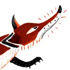
In the 1960’s, there were new ideas about encouraging each child’s potential and a demand for cleaner fresher books. This attracted a lot of serious artists into the field. Brian Wildsmith illustrated the ABC alphabet books in a riot of colour and texture. Pat Hutchins developed ‘Rosie’s Walk’ (a big hit with my children), where the book reads like a silent film. The hen is blissfully unaware that she is being stalked by a fox, which has a series of mishaps which the child can look out for on each page, often before the adult.

Shirley Hughes (another big hit with my children), on the other hand, illustrates real children and their real dramas, such as in ‘Dogger’, where the boy loses his favourite toy. Each picture is a little journey where the child can explore the detail. This is where learning to look can be a pleasure.

John Burningham (one of my favorite illustrators) came up with ‘Granpa’, which tackles bereavement in a sensitive way. Apparently, the book is partly based on an overheard dialogue between his daughter and her grandpa, who lived next door. Burningham uses biros, coloured pencils and paint in a childlike but not childish way. The final page shows the empty armchair where granpa used to sit, which “leaves space for the child to project her/his own emotion”. Burningham is not frightened of ambiguity.

The 1980s brought new innovations in picture books for babies. It was now understood that books can give the baby a chance to hold a mirror to the world around them and explore issues such as friendship and love. Helen Oxenbury’s ‘Friends’ was featured.

Each Peach Pear Plum (Allan & Janet Allberg) illustrates a self-enclosed world, which takes rhymes half in the child’s mind and allows hours and hours of spotting what’s going on in the pictures. This encourages play between the adult and child. It’s like a “join the dots in the story, and the child fills in the gaps.”

We’re Going on a Bearhunt’ (Rosen & Oxenbury) was adapted from an old American camp fire song. Rosen made up many of the wonderful-sounding words, such as ‘swishy-swashy’. It is memorable for the repetition and tension & how real Oxenbury makes the bear look at the end.

So Much (Trish Cook & Helen Oxenbury) has a sing-along read-aloud text and a multicultural face. Trish Cook inherited the oral tradition from her Dominican father. Oxenbury based her illustration on observation, especially of Brixton market.

Lauren Child featured at the end, with her use of humour & multi-media, in ‘Clarice Bean That’s Me’. She was originally illustrating for animation, so she saw the book as a series of scenes. Clarice Bean is a character with attitude, but ordinary too. Her Charlie & Lola books have no adults in them. (I love her characters & humour, but my children never took to them when under five, so I’m not sure how much of the humour is picked up by this age-group).

I started the illustration course wanting to do children’s books, because I’d been immersed in this world with my children for almost ten years. I loved this fairytale magical land, where everything is new and fresh. However, I often find it hard to square the idea of “less is more” with the illustrations of Shirley Hughes, John Burningham, Pat Hutchins and Janet Alberg. I know how much young children love to explore their stories with the pictures, and relate them to their own realities. So my challenge is to make my images rich with visual narrative for the child without making them too real, simple, boring or inaccessible.

Saturday 8 November 2008

Design in the Front Line Climate Camp


I found this information from CR blog (Oct 08) Design in the Front Line Climate Camp
http://www.creativereview.co.uk/crblog/design-in-the-front-line/

"Climate Camp provides an opportunity to examine design activism in action. Jody Boehnert attended this year’s event and reported back for CR.
The design industry is an import­ant player in the creation of a sustainable society, writes Jody Boehnert. Designers could help the world collectively rise to the challenge, but only if we wrench our creative faculties free from their recent history as servants of industry, pawns in a game that spawns the conspic­uous consumption that is now clearly causing ecological overshoot.
The Climate Camp this year took place near the Kingsnorth power station (the site of the proposed first new coal fired power station in the UK in over 25 years) with a day of action that was remarkably disciplined in the face of police intimidation.
Within the Climate Camp activism is evolving. The camp makes sophisti­cated use of the media and its networks through an extensive communications strategy. Activism is said to be the public face of social movements. In a media saturated world the public image of a movement must compete with well-funded industry advertising and public relations campaigns. Design has helped mediate the public image of Climate Camp and transform the move­ment into a friendly, under­standable, but politically powerful voice of dissent. 

Each year the camp has worked with the Manchester-based studio Ultimate Holding Company (UHC) to create an integrated campaign (website, posters, flyers, stickers, etc.). The leading image for the 2008 camp was a Swiss army knife, out of which all the tools of activism extended: here is wrench, book, wind turbine, loud speaker, rubber boot, carrot, and flower.

The camp also produced a newspaper, You Are Here, in an edition of 20,000. Subtle headlines, text and images draw you into the issues slowly. Climate change is not even mentioned or alluded to until several pages into the paper. John Jordan worked on the paper and is one of the key design activists at the camp.
The intention, he claims, is “to make publicity materials which have the slickness of corporate media yet the punch of rebel flyers, the poetic writing of literature yet the political analysis of radical theory, the desir­ability of capitalist design, yet the subversiveness of anarchist thinking”.


Jody Boehnert is a graphic designer and founder of EcoLabs. She has recently started a PhD at the University of Brighton where her research topic is the communication of ecological literacy. This article appeared in the October issue of Creative Review.

Tal Rosner


Tal Rosner Guest Speaker 7th Nov 08

“I think of myself as a sculptor in motion rather than a painter.”

Tal Rosner specialises in low budget. Experimental abstract animation and recently won a BAFTA award for his opening title sequence for ‘Skins’. He brings a strong graphic and kaleidescopic slant to animation. He makes urban industrial units and transport corridors into stunning moving shapes, lines, textures and patterns. It is interesting to find out that his favourite period in history is 1905-1935, with its experimental abstract outlook. He was particularly influenced by the Bauhaus and Josef Albers.

Tal graduated with a degree in graphic design and “a knack for rhytmn and movement’. He was keen to be in total control of a small project rather than part of a team in a large project. He did an MA at St Martins Central college, on the moving image pathway. He produced ‘Doppelganger’ in his final year, 2004/5.

Doppelganger
This 4min (approx) sequence is set in SE London in the docklands redevelopment area. He filmed the journey of the docklands driverless train from the front carriage and edited into moving patterns.

Stravinsky Project
Next, he did a 20 min. dvd project with two French musicians; the ‘Stravinsky Project’. He animated their renditions of Stravinsky and Debussy so it could be marketed to a younger audience. Here, he started to use clouds, water, rippling grass, cranes and windpower turbines as part of the moving images.

Skins 2005
The first series was a very low budget “rebellious idea”. He did 72 versions of the title sequence before he got the final verrsion! He won a BAFTA for this sequence, perhaps because it was so new and cutting edge. He felt it was hard to follow this act when he was invited to do the sequence for the second series, because he had in effect “done it before”. He is currently working on the 3rd series. Someone else does the ‘grading’ edit to his work afterwards, where the colours are adjusted slightly so they tie in.

Barbican live performance – Nan Carrow (American who composed music for mechanical piano). Series of moving and repeating soft-focus white triangles, circles and lines, based on punch-outs, against a black background.

In 7 days of Creation
Live concerts – London/Los Angeles/Amsterdam. Tal’s biggest project.
Tal worked with a composer- music & visuals being sorted out together. Showing the 7 days of creation in an abstract and non-religious way – a definate narrative. Creation of sun, moon, animals, trees. Tal used only the London Festival Concert Hall as source material. The trees had scaffolding as their source. The stars were from light-fittings. This was a 6-screen projection. A click track editor took Tal’s sequence, tracked the visuals and ensured they matched the live music.

Without You – experimental animation for Channel 4
Tal based this work on Josef Alber’s poem:-

Calm down
what happens
happens mostly
without you

By chance, Tal passed Brentford by taxi and was attracted by the new industrial units going up there, and the seemingly random way decisions were made on colours and layout. He drew a circle from the centre of London, which linked Brentford with other similar areas on the periphery of London, and filmed in these places. He wanted to get away from classical music, so he kept the sound on when he was filming, in order to reveal the hidden soundscapes. Roller-shutters, windows, trees, birds all become moving shapes, lines, textures & pattern. The images seem to shimmer like reflections on water, but they become embedded in roller-shutters and branches -  and then the images move as if they are part of a kaleidescope. The images also echo Mondrian’s grid-like compositions. This is Tal’s favourite piece to date.

I found Tal’s work quite inspirational and other-worldly, especially because he can draw out such magic from seemingly ordinary, boring and non-descript urban-fringe and transport-route areas. I didn’t think gantries or light-industrial roller-shutters could look so memerising before. I can look again with fresh eyes! My favourite pieces were ‘Doppelganger’, perhaps because of my interest in train travel, and ‘Without You’ because of its magic.

Saturday 1 November 2008

Personal project

This is my favorite image from my personal project, 'swings & roundabouts'. The feathers have all been produced on the computer. I am trying to use shapes & visual puzzles more, and contrast the shapes with a medieval style (stained glass & manuscripts).

Figure Project

These are the results of the figures I came up with in response to a head & body produced by students from Kingston University. The 1st figure has the head provided by Terry Baker. The pink body (2nd & 6th figure) has been produced by Nicola Pontin. My favorites are the 6th & 5th figures.